Every once in a while since launching this website’s design in 2014, I’ve had thoughts of updating the design, but I could not really come up with any new design that actually felt like an improvement and wasn’t just a way of giving in to any current design trends.
When I overhauled the tech stack in 2022, I thought a proper redesign was imminent, but in the months afterwards I had the same problem. At the same time I had plenty of ideas around design, content and information architecture, but no good design ideas.
Let’s be clear here, this is okay. I’ve got a fully functioning, great looking website already, and generally just other priorities in life.
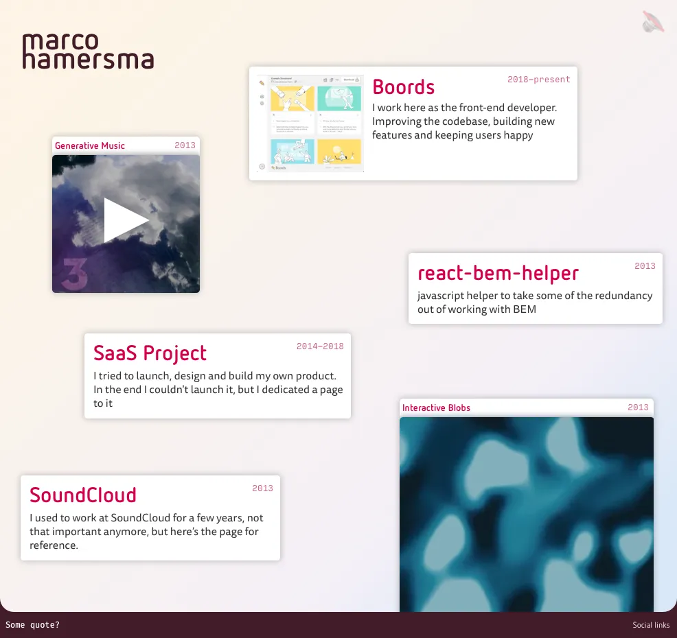
But my front page always felt like a weak point. I mean look at it:
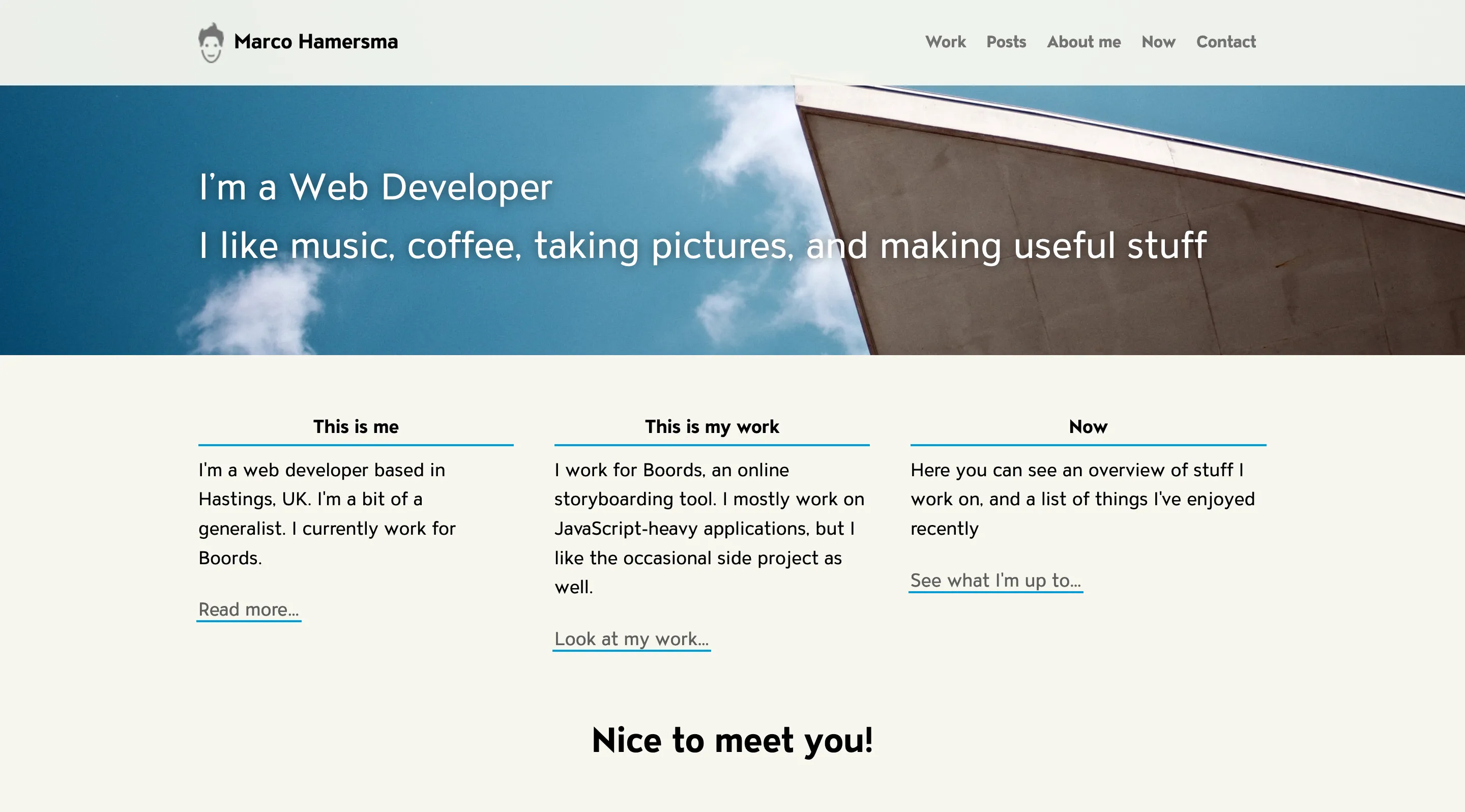
It doesn’t surface any content and doesn’t really tell people much about myself. It feels like a bit of wasted space.
Recently some of the ideas that had been floating around in my head started to crystalise, and I felt that I should at least change the homepage and implement some of the ideas as a start, so here we are:
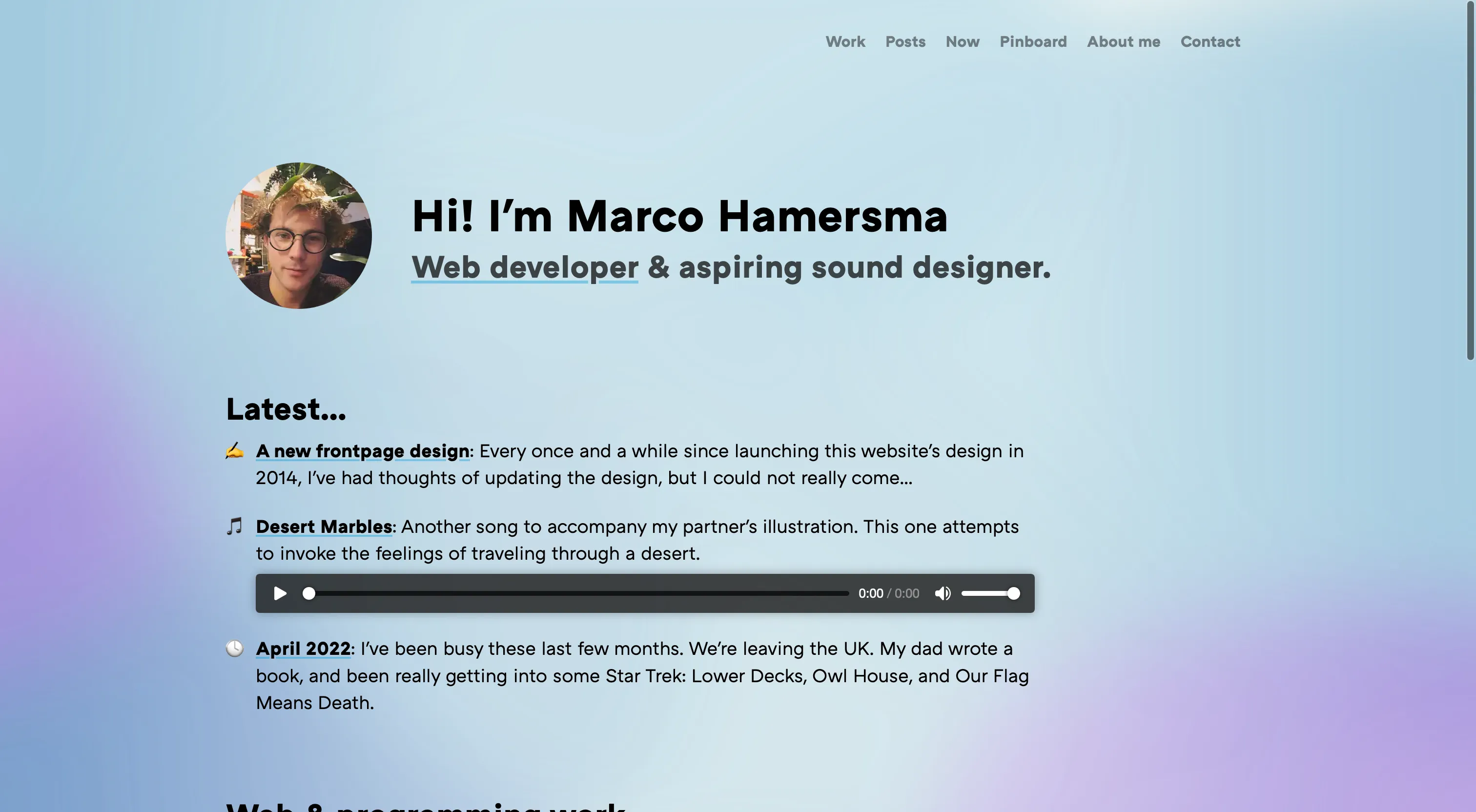
For a long time, I’ve wanted to add a bit more playfulness to the design of my website. I wanted it to feel a bit more like visiting someone’s personal space1, rather than just something formal for potential employers.
So that’s what I’ve done visually. I’ve added some more colour and a bit of subtle movement to the background2 to make it a bit more dynamic. I have not settled yet on the main aspects of the design such as colours, but I’m mostly happy with the new layout of the page. A work in progress… as always 😉
Content
My main goal was to highlight some of the content I’ve put on the website here. I now highlight the most recent posts, now pages, and music I’ve made (sorted chronologically).
I’m also making some more room for Sound Design on my front page. In a way, I’ve been a bit in “stealth mode” with this the last year, at least professionally. I had a secret website for it while I was learning, but I feel all of that isn’t super necessary.
I’m a multifaceted person like many other people, and after almost a year of working on Sound Design, I’d feel like I’d be misrepresenting myself if I didn’t admit that this is part of what I’m doing, so there we are! It probably wouldn’t be long before I move some of my work there onto this website, I just still have to figure out some organisational stuff.
That’s about it for now. As I said, still have plenty of plans for this website for some point in the future. For now, let’s look at some website design sketches I had that didn’t make it in the end:
Old designs
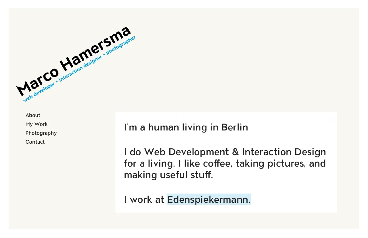
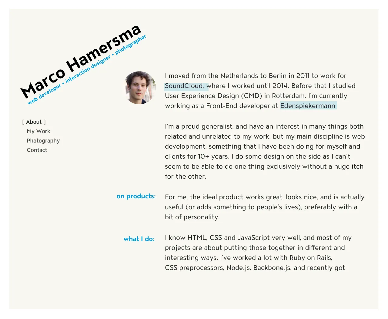
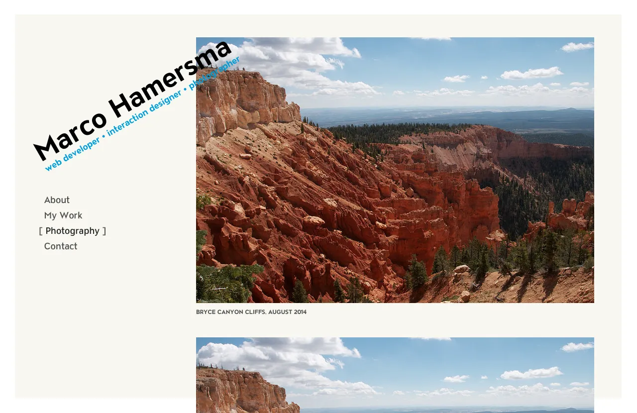
2015: Brutalist
Inspired by some upcoming Brutalist design trends, this was my first attempt at making the website a bit less formal. It featured overlapping elements and ✨ a page border ✨. I liked it, but couldn’t make parts work out properly, and I didn’t know how to translate the design to mobile browsers.
2019 - Softer
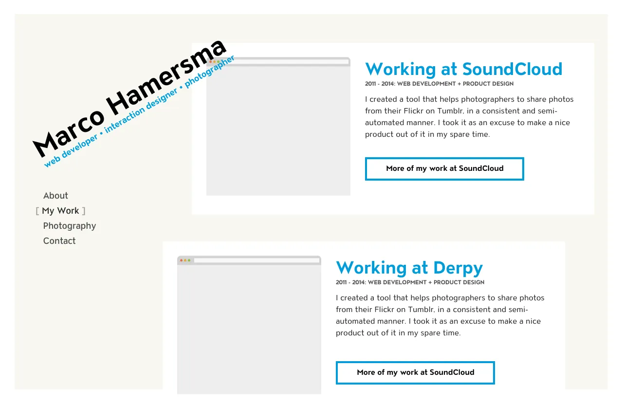
These were my first attempts to get rid of the business blue on my website and focus more on my creative output. I was quite into coding weird visuals, basic simulations, and generative music at the time, and wanted to give that a place on my website.
I quickly realised this wasn’t quite it either, but this is where the idea of highlighting specific pieces of content on the front page came from. Some were even interactive. I feel like coming back to that later.
-
I wrote about this a bit more in my previous article about my website. ↩
-
At the moment, these are just some blurred CSS shapes in various colours. I want to replace this with a canvas in the future, but not before I’ve settled on a new design. It’s worth noting here that I want to respect people’s accessibility settings here, so if the user has turned on “Reduce motion” or equivalent settings in their OS’s accessibility settings, the background is static. ↩