SoundCloud
Web Development + Product Design, 2011 - 2014
When I started at SoundCloud, the employee count was only about 35 people. When I left, they employed more than 200 people, with offices in Berlin, London, San Francisco and New York. That was quite a change.
Different skills
During my time there, I’ve changed roles a number of times. When I joined, I wanted to learn a lot about backends and Ruby on Rails, which at the time was what most of the platform ran on. I later got the itch to work on more user-facing components, and changed teams to work on the front-end heavy next version of SoundCloud that launched at the end of 2012.
I wanted to do more design within SoundCloud, so in 2013 I joined the Growth team as both a Product Designer and a Front-end developer, in the hope of combining my two biggest interest. In that team I was responsible for almost the entire stack: doing the first sketches, designs, prototyping, and deployment. I worked a lot on email campaigns and also designed soundcloud.com’s new onboarding flow. I also worked on new designs for the settings page, but these haven’t been rolled out yet.
Some projects I’ve worked on:
I worked on many projects over the years, both in the backend and frontend fields, but here’s three: The new user onboarding on SoundCloud.com, the frontend SoundCloud.com, and various email campaigns and templates for the Growth team.
User Onboarding
SoundCloud’s previous onboarding was quite intrusive and focused primarily on following users. We found that it wasn’t working well: people were confused with the results, and a large number of users that sign up, didn’t come back after.
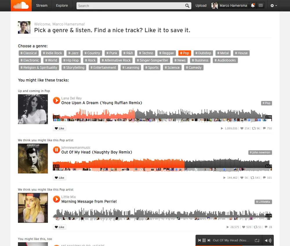
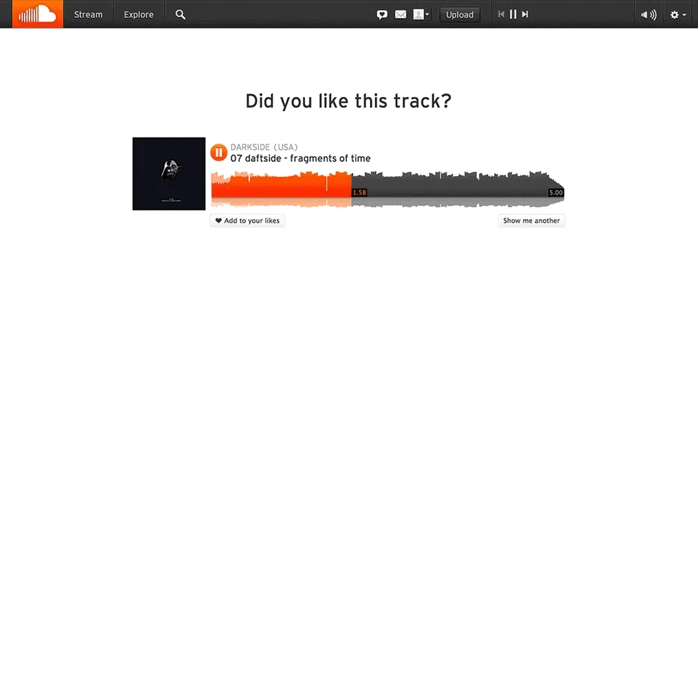
We decided to use our data to create a new version of the onboarding that hopefully created better retention. I was responsible for the concept, design and front-end for this project, working closely with my product manager and colleagues from the design team. We set out to offer a personalised experience based upon the user’s recent listening history, and familiarise the users with the concept of liking a track. This would also feed SoundCloud’s recommendation engine with more data.
Exposing both breadth & depth
The team built a custom service that would extract a list of genres from the user’s listening history. For these genres it would then find similar tracks, trending tracks, featured content, and tracks from related genres. This content would then be shown to the user besides their own history. We showed a genre selector when there was no listening history:

Respecting the user
If you want to explain certain concepts to users, it is sometimes necessary to be a bit intrusive, but this is often taken a bit too far. I wanted to make sure we were in the sweet spot between intrusive and easily dismissible, and also designed the process to be flexible in duration: It could be very short, or longer if the person wants to indulge a bit in what we offer them. The continue button was outside the viewport to stimulate scrolling past the 15 items, but navigating away was also possible.
The process & research
Most of the concepts I made started on one of many A3 papers that I used as a brain dump and a way of quickly mocking up ideas. After a sketch was made, I typically made a low-fi version in Sketch, where I often made a lot of versions as well.

A small selection of different designs for the process. Sadly, I lost my photos of paper sketches during this time.
My front-end experience made it easy for me to code up prototypes for internal and external usability testing. I also used tools like 5 second tests and Usability Hub to measure the understandability of my concepts.
SoundCloud.com
When I joined SoundCloud, most of my work was in the old Ruby on Rails app that contained everything that SoundCloud was. I liked learning to work with Ruby a lot, but was still primarily focused on front-end work. During that time, I learned a lot about ruby, backend engineering, code style, HAML and SASS.
In 2012, SoundCloud started working on what was then called “the Next SoundCloud”, a single-page web application that launched at the end of that year. I joined the project a few months before that. It is built upon Backbone.js and a custom built UI framework. Dealing with these systems taught me a lot about building scalable, modular components and styles.
I worked on many different things on the website, but a fair share was around UI bugs and improvements. If there wasn’t a designer available, I could often propose a design for new features, which sped up the process a lot.
Email Campaigns
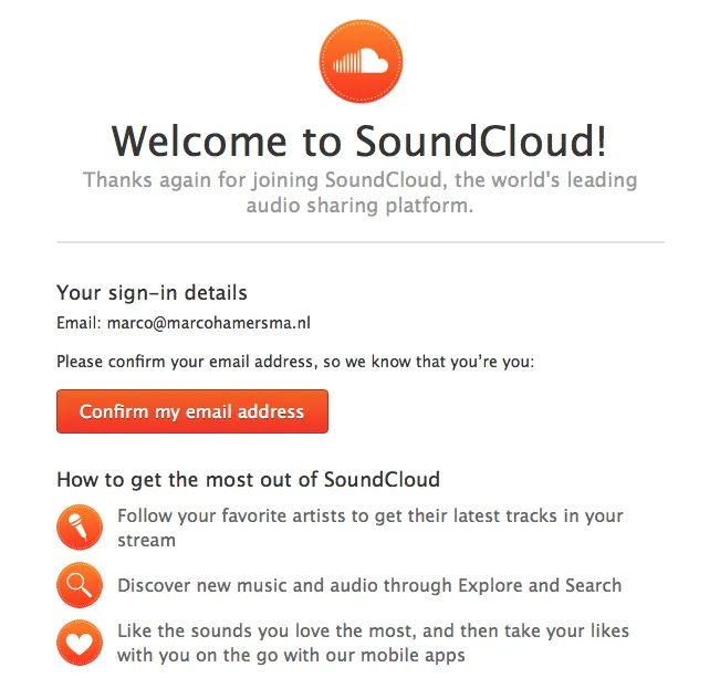
At the time when I joined the growth team, the user experience around emails wasn’t very good. Emails weren’t really designed, unsubscribing was a hassle, and – most importantly - did not scale down properly on mobile. At that time, just over 50% of our email activity was on mobile, so the team was about to completely rethink our email strategy, and it was my task to make sure the emails looked and felt good.
Over time I made a number of new standardised and custom email templates that were fully flexible and responsive, so they looked good at any size.

Although template designs initially came from Photoshop or Sketch, many were built in code once most components were modularised.
We eventually ended up transferring numerous transactional emails and newsletters to our infrastructure (and templates) as well, which allowed us to guarantee a consistent and user-friendly user experience for email. This included limiting the number of emails sent to each user.
Template Tool
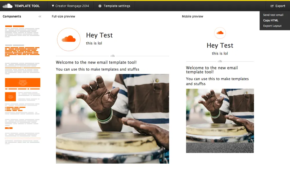
Even though at the end of my time at SoundCloud most of the company’s emails were responsive, the newsletter was not. At the time the community team was using an old tool to compose the monthly email newsletter, but the designs that this tool generated were outdated and – again – not responsive. It was also quite hard to update the components and designs that this tool used, so I decided to make my own.
This made sense because I already learned a lot about coding and designing for emails, and already had isolated different components for our emails.

Users of the tool can add and move around individual elements of the email. The tool can export HTML, send test emails, or export a representation of the layout for in our email system. The components can be easily edited by the maintainers of the tool by updating the HTML and data files for each component.
The tool was developed inside SoundCloud’s “hacker time” (20% time), and it was fun making something that would serve both our community team and the users. It was a bit hacky, but worked. I didn’t manage to do a second iteration on it, as I left the company shortly after finishing the first version.